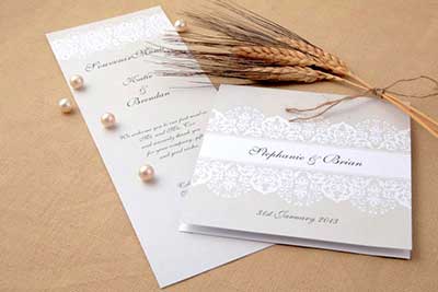
If that’s your thing, go for it, but for many couples, working out the design concept can be daunting.
Chances are, you already have a good idea of how you’d like your wedding invitations to look; the challenge now is turning those ideas into reality. The first thing to consider is what components of your invitation you’d like to put where. The aim is to balance the quantity of text and visual items and create a pleasing arrangement.
Layout
Your wedding invitation’s primary purpose is to share information. That needs to be your first priority. However, a wedding invitation also serves other purposes, for example, reflecting and setting the tone of the day and explaining who is hosting.
Formal invitations for weddings hosted by parents and at more than one venue will require more text than a simple affair hosted at home by the couple themselves. If your wedding is closer to the former, you are likely to have more text than visual imagery and if it’s the latter, consider using bold visual imagery.
For text-heavy invitations, use a simple visual motif, for example monogrammed initials and a single symbol. Where text is lighter, focus on visual details that set the tone of your celebration. Your central image could be a homemade motif crafted by yourself, perhaps using ribbons, buckles or washi tape, or a great photograph or simple illustration.

Scale
Fun, informal weddings suit fun, informal invitations. Consider sticking with a simple font and scaling up key words to make them stand out. More formal invitations work better on a smaller scale, perhaps with calligraphy or more detailed fonts. The aim with scale is to balance your components so they aren’t competing with each other, but instead highlight the most important information and support the design concept.
If some guests need extra information, for example maps, enclose these separately in your invitation to avoid cluttering up the design of the card. Have a look at origami ideas to find ways to attractively package your invitations, or consider crafting an origami heart or star as a save-the-date.
Composition
Consider how you want your invitations to be laid out. Essentially, this boils down to whether you want a visual border or not. If using a border, make sure there is plenty of space between it and the central image or text, as well as the outside of the card, especially if the image is to be printed.
You might also consider extending an image beyond the edge of your card. This is known as a bleed. These can be extremely difficult to print at home, usually requiring some trimming at the end, so consider getting invitations like this printed professionally or prepare for painstaking cutting at the end.
Previous Post: Save Money on Your Invitations and Thank Yous
Next Post: Make Your Own Beautiful Bunting: Here’s How


